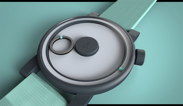
 We’ve already featured a couple of watch designs that do away with the traditional hands to tell the time (like the Hands-free EPIC). Today we feature another such concept. The Círculo Watch by Andres Felipe Gil Hincapie is about as minimalist as you can get with a watch.
The white dial is as stark as can be. There are no numbers, markers or any other markings. The center is dominated by a black circle with a logo. Around it travels another circle, this one hollow, to mark the hours. This second circle also revolves around itself. An orange marker denotes the minutes. Seconds are marked by a second marker that travels on the outside edge of the dial. In the image below, the time is 07:52:16.
The only other somewhat different design element is the placement of the crown at the two o’clock mark rather than the more traditional three o’clock one.
There is no word on any specifications. With such a stark design, it is easy to envision that the Círculo Watch could come in a range of colours, materials and sizes.

What do you think of the Círculo Watch? Do you like the stark hands-free design? Let us know below.
Source : Behance
