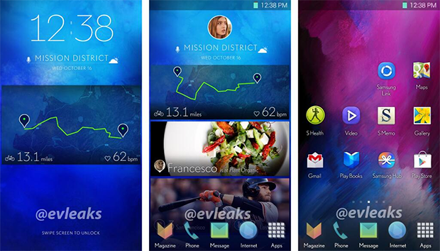
Recent images leaked by @evleaks suggest that Samsung may soon unveil a much revamped version of its TouchWiz interface that may adopt a new user interface that is reminiscent of Google Now’s card based interface albeit far richer in its use of images and colours. We got a taste of this new look with the Magazine UX that Samsung recently unveiled with its Galaxy NotePRO and Galaxy TabPro tablets.
Between the two sets of images, we can conclude that the card-based pages will be the focal point of the interface. They will present information as varied as daily news and social media updates to upcoming flight information and status of recent orders and other transactions. Behind these cards which might be presented on both the lockscreen and homescreen will be the traditional pages with widgets and app icons. On the homescreen, these tiles may also scroll up and down.

It’s not clear at this point when Samsung might introduce the new interface but one good bet might be that it will make its debut on the Galaxy S5. After all, Samsung Mobile executive vice president Lee Young Hee recently promised that the company would pay more more attention to the display, something we initially thought pointed to the hardware but could equally apply to the interface as well.
Sources : @evleaks (1) // @evleaks (2)
