 Introduction
Wearable technology is getting a lot of coverage these days. Many of the big players have entered the market space and those who haven’t are rumoured to be entering shortly.
One of the big successes in wearables has been Pebble; makers of the Pebble smartwatch. Pebble garnered attention when it launched its Kickstarter campaign in early 2012. Pebble was hoping to raise $100,000 in that campaign and ended up raising $10.26 million from nearly 69,000 backers. Full disclosure – I was one of those backers and I have also purchased the Steel version.
The original watch was delayed several times, but when it did finally ship it launched a new era in wearable technology.
Jump forward a year and Pebble watches are now available at Target, Best Buy and FutureShop. Pebble have also released a second model of the watch; the Pebble Steel, a major new OS version and the Pebble Store for adding watch faces and watch applications.
There are two ways to talk about the Pebble Steel smartwatch; as a piece of technology and as a fashion accessory.
A closer look at the Pebble Steel
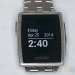
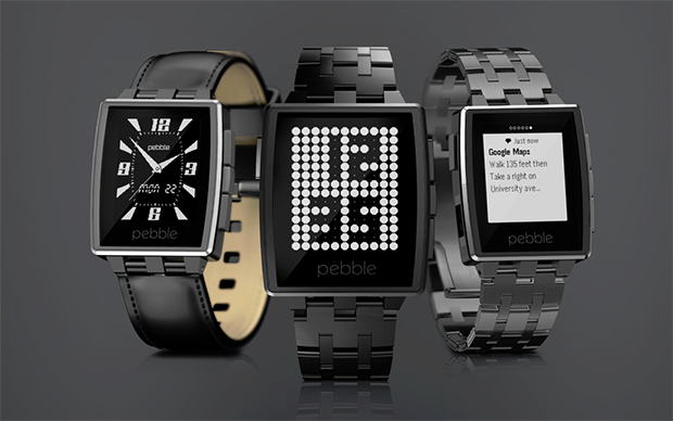
The Pebble Steel is available in either a black matte or brushed stainless steel finish. My stainless version shipped with both a leather and stainless steel band in a nicely packaged box. The box was a nice design choice for the Steel. The original shipped in a dedicated cardboard package that was very unique. Pebble could have shipped in a static free bag and few would have mentioned it. Their dedication to the packaging helps better define the product and make it stand out. The Steel packaging provides an air of sophistication.
I preferred the stainless steel band and swapped it out easily. However removing a couple of links required taking the Pebble to a store to have a trained person take them out. Pebble recommends using a professional to adjust the strap.
The Pebble Steel has just enough weight to it to make it feel like you’ve got something substantial on your wrist, but it is not too heavy. The build quality on the Steel is quite good; the strap closes securely and I haven’t put any scratches on its display in near continual use since it arrived.
A definite advantage to the Steel over the original watch is the use of Corning’s Gorilla Glass for the watch face. My original Pebble has a few deep scratches across the plastic face. The Steel has been scraped against a few abrasive surfaces and the display doesn’t have a mark on it. The body shows a few signs of wear though. The only complaint I have about the Steel is a slight rough edge where the stainless steel meets the glass. If I run my finger against the metal I can feel that it isn’t 100% flush to the glass. It’s not a critical flaw; likely more of a slight manufacturing issue. I haven’t seen another Pebble Steel to compare it to.
The Steel is much more fashionable than the original. The Steel is equally at home with a pair of jeans and t-shirt as it is in a business environment. It is a good looking watch.
Using the Pebble Steel
Where the Pebble Steel really shines is as a piece of technology. Pebble has done a very good job with their 2.0 software and recently opened Pebble Store.
Before Pebble OS 2.0 was released, getting new watch faces was a bit of a jumble. There are many websites that have downloadable faces, apps and web-based watch face generator systems. All work, but it means going to different sites to find what you want.
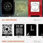
With OS 2.0, Pebble’s app for iOS and Android offers a single location for finding new wares for your watch.
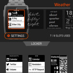
The Pebble (either original or Steel) communicates with your mobile phone to load new watch faces and applications via Bluetooth Low Energy. The Pebble is able to hold up to 8 items at a time with others being relegated to a “locker”.
- Pebble watchface selection
- Pebble watchface selection
- Pebble watchface locker
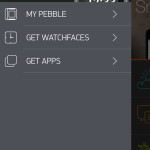
A menu option in the mobile application allows you to see what is currently on your watch, browse downloadable watch faces or applications, configure items you have downloaded and set up the watch to communicate with your phone.
- Pebble OS 2.0 menu
- Pebble OS 2.0 menu
Installing a watch face or application requires an open “slot” on the phone and tapping on it in the Store interface. Apps and watch faces can be loaded and unloaded with a tap. I have yet to hit a limit as to how many items can be in the “locker” area.
Some apps and faces can be configured from within the Pebble mobile application, others require a separate app which is downloaded from the app store on your phone. I have seen several paid apps, but most seem to be free.
- App store
- App configuration
Some Pebble apps are platform specific. I tried to download a couple that were Android-only (I’m on an iPhone 4S). I could still download the app and install it, but it would not run. Once I noticed the Android-only icon in the store (doh!) I browsed elsewhere. Most apps that I’ve looked work on both iOS and Android.
The big question – are watch-based apps actually useful? In my opinion – yes.
The most-used apps are going to be for receiving email and text messages. Once the notifications have been enabled on your phone, you will receive text-only versions of part of your messages. HTML-only email won’t display properly on the e-ink screen of the Pebble. Short email messages will display and SMS messages are generally fine. Anything of significant length will display the beginning of the message send you reaching for your phone. There is no way to reply to an email or text message from the phone. If an email or text needs to be replied to, you’ll do it from your phone (or computer). The interface on a watch isn’t geared towards text entry. You likely wouldn’t want to try to compose a message on the Pebble.
Every once in a while the Pebble will lose its connection with your phone and notifications won’t come through. It’s hard to determine if this is an issue with the Pebble OS or the phone OS. It’s generally a quick fix to either re-connect the Bluetooth Low Energy connection or reset the notification system on the phone. Several of the apps I’ve tried will make the watch vibrate when you lose connection to the phone.
One other issue that I have encountered with iOS 7 and Pebble 2.x is when unlocking the phone a number of alerts will suddenly get pushed to the Pebble. Some alerts that I had seen already, some not. No idea where the issue is – Pebble OS or iOS but every so often things get stuck. Unlocking the phone releases everything and all is good again.
- Pebble OS 2.0 diagnostics
Many of the watch faces that are available are of limited use. Personally, I like something simple, attractive and useful to look at. There are many watch faces that display your favourite team’s logo, car emblem, cartoon character or something that will be entertaining for 30 seconds before getting relegated to the locker or deleted all together.
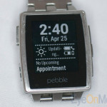
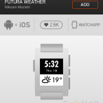
There are other watch faces that have real use; combining the time with the date, adding in weather details, unread email count or upcoming calendar events. These are the types of watch faces that make it possible to leave your phone in your pocket and not feel that you’re out of touch with the world.
There are apps to control your GoPro camera, work with the Pandora music service, get sports updates, play games and monitor fitness activity. Currently the Pebble Store has categories for Daily (weather, stocks, calendar, etc.), Tools & Utilities (timers, counters, Evernote, GPS info), Notifications (RSS feeds, Twitter, etc.), Remotes (controlling other devices connected to your phone), Health & Fitness (step counters, heart rate, score counters, bike computers) and Games (tic-tac-toe, mine sweeper, dice games).
Many of the watch applications are very dedicated to what they are doing; they aren’t trying to do everything for everyone. You won’t find a version of Microsoft Office on your Pebble but that doesn’t mean that somebody won’t try. I think that several small, dedicated applications that do one thing well are better than having apps that try to do too much and don’t do anything particularly well.
The inclusion of configuration tools within the mobile app (or external app) means that the user doesn’t have to try to customize the downloaded app on the watch, where the user interface wouldn’t work well. Pushing the heavy lifting back to the mobile device makes it much easier to customize and configure the software and gives the developer more options.
The mobile phone application still needs a little work. When searching for a watch face or an app the phone app performs a “live search” after every character typed. This slows the responsiveness of the phone down while the search is performed. I’d prefer it to do a single search after I’ve entered my criteria. It is easy to find an application and get it installed. The phone application will also provide notifications for firmware updates for the watch and install them.
One of most used apps for me is the music player. It’s great at the gym; the phone stays in a pocket or armband and I can control my music via the watch. You can’t control everything, but skipping through songs is generally enough.
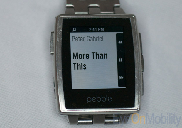
The Pebble also controls answering calls on the phone. This is especially useful while in the car, where you’re not supposed to have the phone in your hand while driving. I can see who’s calling and either answer the call or push it to voice mail. Its questionable if looking at my watch is less distracting than looking at my phone but I won’t get a ticket for looking at my watch (yet).
One thing to remember is that any app that updates the screen frequently or pulls data from the phone is going to use the battery up faster. Usefulness and eye candy comes at a cost.
Both versions of the Pebble use a proprietary USB cable to charge. The original Pebble and the Steel use different cables. Both feature a magnetic connector to keep it fastened while charging. The watch usually lasts 4 or 5 days on a charge and takes a couple hours to fully charge when plugged in to a laptop. A welcome improvement made to the Steel from the original is including a LED on the watch to indicate charging status. The inner workings of the watch appear to be the same on both the original and Steel versions. The Pebble Steel is more of a fashion upgrade than a functional upgrade.
Pros
- Much more stylish than the original Pebble
- Corning Gorilla Glass protection for the display
- Pebble OS 2.0 a significant improvement
- Compatible with range of Android and iOS devices
Cons
- Occasional connectivity issues
- Mobile phone application can still be improved
Conclusion
Overall, I have been very happy with both versions of the Pebble. The Steel is a big improvement over the original watch as a fashion item. The OS 2.0 upgrade with the Pebble Store makes the watch even more useful. Pebble OS 2.0 runs on both the original and Steel watches. Finding the apps and watch faces that are “right” for you may take a bit of hunting and the maximum of only 8 slots on the phone may seem limiting at first but changing what is installed on the watch is quite easy. My biggest issue is remembering to charge my watch.
The Pebble watch is the first multi-function wearable that seem to have gotten it right; small apps that do simple, but useful, things. It also doesn’t look like a piece of technology. The infrastructure has had a few bugs along the way; the OS has been patched, pulled and patched again. Not all watch faces or apps work perfectly but we’re getting there.
The Pebble allows you to be more connected to the world while not appearing to be. With the Pebble smartwatch you don’t always have to reach for your phone to see what’s going on. A quick glance will let you determine if further action is required.
Wearable technology is going to become more and more pervasive over the next few years. In my opinion, the Pebble smartwatch is leading the way.
Where to buy
The Pebble Steel is available directly from Pebble for US$229 with leather band or US$249 with metal band. The original Pebble is also available. It sells for US$150 and is available in a range of colours including black, grey and orange.
While the Pebble Steel cannot be bought at Canadian retailers, the Pebble is available through retailers such as Best Buy and Future Shop.

