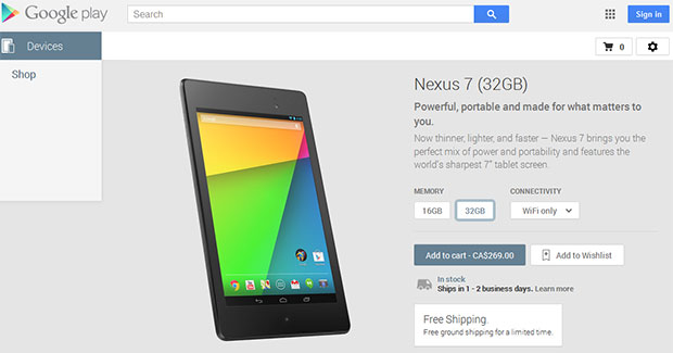
 Google today updated the user interface of the Devices section of the Google Play store. The change is not a significant departure from the current look and feel but will make it easier to select between different configurations of a device.
Above you can see the new layout for the Google Nexus 7 (2013) in the Google Play Devices section. The new layout makes it easier to see and choose different configurations.
Is it a coincidence that this section has been updated just a day (or two) ahead of the expected launch of the Google Nexus 5?
Check it out for yourselves and let us know what you think of the new layout.
Source : Google Play
